 SEE YOUR BRAND FROM EVERY ANGLE.
Start by asking yourself one visually-oriented question: if my brand were a person, what would that person look like? Old and wise? Young and energetic? Intellectual and reserved? Muscular and powerful?
If this sounds silly, may we remind you of KFC’s Colonel Sanders, Progressive’s Flo, and Dos Equis’ Most Interesting Man in the World? Or, even more fancifully, Procter & Gamble’s Mr. Clean, Planters’ Mr. Peanut and Kellogg’s Tony the Tiger? All of these are personifications of brands, and personifications can help define other sensory details about your brand such as vocabulary, tone, and personality.
Next, think about color, perhaps the most powerful subconscious brand cue. Ever wonder why so many hospitals and health care companies use blue as a primary color? Because subconsciously, we associate health with the color blue. Conversely, we rarely see restaurants use blue as a primary brand color. Why? Blue suppresses appetite.
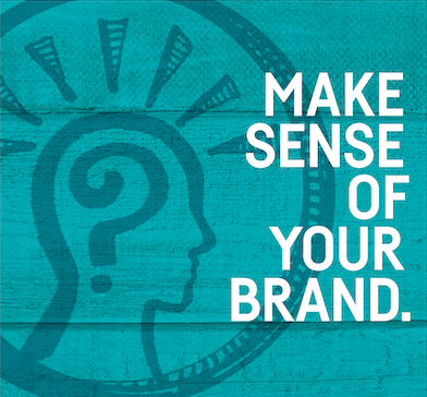
Make sense of your brand with our BrandSense Toolkit: Sight | Sound | Touch | Taste | Smell | Intuition
Our full brand and creative toolkit gives you access to a number of eye-opening tools and processes:
SHAPE AND GEOMETRY ANALYSIS
How does your current messaging incorporate shapes, angles and lines? Heavy or soft? Thick or thin? What connotations are you giving
your customers?
VISUAL IDENTITY BREAKDOWN
Is your logo consistent, or does it have variations? How many lockdowns exist, and are all of them needed? Does the logo appear in a consistent position?
TYPE, ILLUSTRATION AND PHOTO TREATMENT
Is there a consistent aesthetic that ties together these visual elements? Does the type selection match individual and overall perceptions?
COLOR PALETTES
Does your brand have a primary, secondary and tertiary color scheme? Is color applied consistently?